


Where Metallic Laminates Work Best in Contemporary Interior Design?
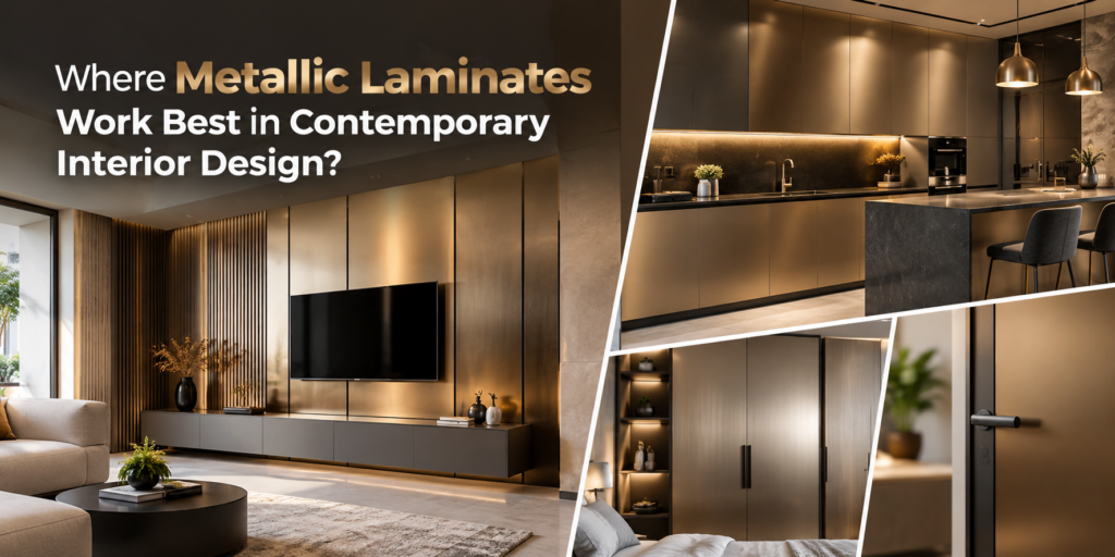
Where Metallic Laminates Work Best in Contemporary Interior Design?
Walk through a newly finished flat and you rarely remember the shape of the furniture. You remember how the surfaces caught the light: a matt wardrobe that swallowed the bedside lamp, or a glossy panel that threw a bright stripe across the floor at four in the afternoon. Metallic laminates sit at the far end of that range. On a single wall or a few cabinet shutters they lift a plain room. On every surface they turn it into a showroom.
This guide is for homeowners, designers, carpenters and shop-fitters deciding where a metallic finish earns its place. If you are shortlisting Metallic Mica Manufacturers, it also covers what to check before sheets are ordered.
What Makes Metallic Laminates Suitable for Modern Interiors?
Metallic laminates give the look of brushed, polished or shimmering metal without the weight, cost or fabrication work of real metal sheet. The decorative surface is bonded to a board such as plywood or MDF, so a regular carpenter can cut, edge-band and fit it.
What you finally see depends on four things. The first is the finish, since a subdued metallic reads very differently from a high-shine one. The second is the colour tone, because champagne, bronze, graphite and silver-grey each behave differently. The third is the materials beside it, and the fourth, above all, is the lighting.
Contemporary rooms suit metallic surfaces because they already rely on contrast: simple geometry, restrained colour, one or two deliberate accents. A metallic panel can be that accent. It struggles when everything else in the room is also trying to be the accent.
Where Metallic Laminates Work Best
1. Kitchen Cabinets and Storage Units
Kitchens are where metallic finishes tempt most and get overdone most often. A workable rule is to confine them to one plane: overhead cabinets in a metallic shade above wood-look base units, or a tall pantry unit at the end of a run. Keep the shutters around the hob in a matt or textured finish, since glossy surfaces show grease and fingerprints quickly. Keep any laminate away from direct heat, and check the technical details of the specific product first. Matching edge banding matters more than usual here, because a mismatched edge on a reflective shutter is visible from across the room.
2. Wardrobes and Bedroom Furniture
Wardrobe shutters are large, flat and usually face the bed, so a metallic finish will mirror the window by day and the bedside lamp at night. Limit it to two or three central shutters or to a dressing unit, and keep the rest softer. Warm bulbs flatter bronze and champagne tones, while cool white LEDs suit silver and graphite. Hold a sample up under the lamp you actually use before deciding.
3. Living Room TV Units and Feature Panels
A switched-off television is a dark rectangle, and a large metallic backdrop behind it competes with the screen’s own reflections. A better layout is a vertical metallic panel or strip beside the screen, with a wood finish or a plain neutral directly behind the television. Keep the panel out of the direct line of the window so it does not throw glare across the sofa.
4. Office Interiors and Reception Areas
A reception counter front is the textbook case: seen from the door, rarely touched, lit by downlights. Use metallic on the front panel and a matt surface on the working top, where staff write and visitors lean. Storage cabinets and meeting-room credenzas can take the same finish in a quieter shade. Avoid it on desktops, where reflections fall straight onto monitors.
5. Retail Stores, Cafés and Hospitality Interiors
Here the finish works best as a repeated thread. Use the same shade on a display plinth, a counter front and a shelf fascia, tied to the brand colours and lit from an angle that does not bounce into customers’ eyes. In a café, back-bar units and counter fronts are the usual candidates. Tabletops are not, because cups, cutlery and hands will mark them. Riddhi Siddhi Laminates positions itself among Glitter Mica Manufacturers in Nepal, so sparkle-led accents for counters and display fronts are worth asking about when you request the catalogue.
6. Decorative Furniture and Display Units
Small pieces are the low-risk way to test a metallic finish. Good candidates are shelf fascias, a console with metallic doors under a timber top, a side-table base, or the back panel of an open niche. Metallic laminate at the back of a dark niche bounces light into the corner and makes displayed objects stand out.
How to Combine Metallic Laminates with Other Finishes
Wood is the easiest partner. The warmth and grain of timber-look laminates break up the coolness and uniformity of a metallic surface. Neutral shades such as off-white, greige and soft grey act as buffers and give the eye somewhere to rest.
Stone-inspired and marble-look finishes need more care, because two highlights compete. Give each its own job, with marble-look on the countertop or feature wall and metallic on the cabinetry. The Riddhi Siddhi Laminates website describes its Imperial Mica as a marble finish gloss mica and a popular choice for kitchens, wardrobes, furniture, wall panels and commercial interiors. That page is worth reading if you are comparing Marble Finish Gloss Mica Manufacturers.
For lighting, indirect sources such as warm strips under overhead cabinets or wall washers are kinder than spotlights aimed straight at the surface.
The company’s range is organised by thickness. The 0.7mm range lists Neo Lam, Nepal Lam, Nepal Lam Fabric, Nepal Lam Fabric Non Brand, Real Mica and Shark Mica. The 0.8mm range lists Mirror Mica and Imperial Mica. When comparing 0.7mm Laminates Manufacturers or 0.8mm Laminates Manufacturers, ask which thickness suits the application and the board. Confirm the currently available metallic-look or glossy designs in the E-Catalogue, since shades change from time to time.
Tips for Choosing the Right Metallic Finish
- Test in the room’s own light. View the sample vertically, at the height it will be fixed, in both morning and evening light.
- Check the undertone. Cool silver beside yellow-toned timber looks mismatched, while bronze or champagne usually sits better.
- Match the finish to the use. Vertical shutters and wall panels are forgiving. Handle-side edges and counter tops are touched constantly and mark quickly.
- Plan maintenance. A soft, damp cloth is the usual starting point. Avoid abrasive pads, and confirm cleaning advice with the supplier.
- Read the technical data. Reputable Mica Sheet Manufacturers publish test properties. The Riddhi Siddhi Laminates product pages carry specification tables referring to IS 2046 properties such as surface wear, scratching and staining, along with downloadable catalogues.
- Order for one room together. Ask Mica Manufacturers about batch consistency, and buy all the sheets for a room at the same time to avoid slight shade differences.
- Prepare the substrate. Reflective surfaces exaggerate bumps, so the board and adhesive coat need to be flat and clean.
Common Mistakes to Avoid
Covering too much. When every shutter, panel and counter is reflective, no surface stands out and the room feels harsh. One or two metallic features per room is a sensible limit.
Clashing colours. Metallic tones pick up the colours around them. Check the sample against the floor, walls and timber together, not on its own.
Wrong lighting. Spotlights aimed at metallic surfaces create hot spots, and a window directly opposite creates glare.
Choosing without considering the application. A surface that looks right on a sample board may be wrong for a splashback near heat, a heavily used counter or a sharply bent edge. Check suitability with the supplier before ordering.
Overlooking joints and edges. Gaps, uneven edge banding and visible adhesive lines all show up on reflective sheets, so the carpenter’s finishing matters as much as the sheet itself.
Conclusion
Metallic laminates work best when they are placed deliberately: one feature wall, a run of wardrobe shutters, a reception counter front, rather than everywhere. The finish, the undertone, the neighbouring materials and the light in the room decide whether the result looks considered or crowded.